Pre-Publication Paper: “Applying Artistic Color Theories to Visualization” by Theresa-Marie Rhyne”, published in Expanding the Frontiers of Visual Analytics and Visualization, Co-Editors: J. Dill, R. A. Earnshaw, D.J. Kasik, J.A. Vince, and P.C. Wong, Publisher: Springer, pp. 263 - 283, 2012. Click here to view online version of published chapter.
- Welcome
- Continuing On
- Applying Color Chapter
- Color Analysis of Historic Infographics
- Color Scheme Design
- Stanford Color Suggestion Tool
- Colorization of Ensemble Data
- Color Studies with Apps
- 3D artwork
- Evolving Collage Methods
- Digital Media
- Exploring Vis Theory
- Visual Analytics Work
- Vis Research Issue
- 25th VIS Anniversary
- Snapshots of VIS Trends
- VisViews Dept Listing
- Color Theory Blog

Applying Artistic Color Theories to Visualization
Theresa-Marie Rhyne, Independent Visualization Consultant
Abstract:
We explore practical approaches to applying color theory to creating and examining visualizations and digital media. Our paper highlights general background on color theory as well as various color models and color spaces developed by painters, printers and scientists over the centuries. We review the color wheel as well as the hue, saturation and brightness (HSL) and hue, saturation and value (HSV) models targeted at addressing color display monitors and digital media. Finally, we discuss color schemes and show how these concepts can be applied to creating color maps for visualizations. We explore color analysis methods using online systems such as Adobe’s Kuler and Color Scheme Designer tools.
Introduction:
Color Theory includes the practical knowledge on the mixing of colors as well as the visual impact of specific color combinations. This paper explores practical approaches to applying color theory to creating and examining visualizations and digital media. We begin by providing some background on color theory including its application to computer graphics and digital media. We highlight various color models and color spaces established by painters, printers and scientists over the centuries. Next, we review the color wheel and how it is assembled. From there, we highlight the hue, saturation and brightness (HSL) and hue, saturation and value (HSV) models targeted at addressing color display monitors and digital media. Color schemes and their relationships to the color wheel follow.
With these color theory concepts, we explore analyzing the colors in digital imagery. We show how online systems such as Adobe’s Kuler and Color Scheme Designer tools can aid us in this color assessment process. From there, we apply color scheme concepts to creating visualizations. We show a step by step process for building individual color maps for two data visualization examples. Finally, we provided a detailed bibliography of historical writings on color theory and listing of selected color and visualization tools we have used.
Some Background on Color Theory:
Writings on color theory can be traced back to Renaissance times and include entries in the notebooks of Leonardo da Vinci in the 1490s. It was not until the 1660s when Isaac Newton and others developed color optics and the notion of primary colors that “color theory” evolved formally as a body of knowledge. Although there are many scientific theories based on color perception and vision science, our discussion here focuses on artistic notions of color theories.
Color Theory was originally defined in terms of three “primitive” or “primary” colors, Red, Yellow and Blue. (RYB). It was thought that various combinations or mixtures of Red, Yellow and Blue yielded all other colors. This color mixing behavior was recognized and applied by printers, dyers and painters. The two founding documents on Color Theory appeared in the 1800s. The first was produced in 1810 by Johann Wolfgang von Goethe and entitled “Theory of Colours”. The second writing, produced in 1839, was prepared by Michel Eugene Chevreul and entitled “The Law of Simultaneous Color Contrast”.

Figure #1: The Artistic or Painter’s primary color model of Red, Yellow and Blue (RYB).
In the late 1800s, English and German scientists established color perception principals based on a different set of primary colors. These Red, Green and Blue (RGB) primary colors were based on an additive mixture of monochromatic lights. Further research of different responses to light in the retina of the eye established three (Red, Green and Blue) types of color receptors or cones in the retina. Hermann von Helmholtz’s publication, The Handbook of Psychological Optics, articulated these concepts in the 1850s and 1860s. The usage of RGB as a primary set of colors was thus solidified. In the early 1900s, with the use of the RBG primary set of colors along with a series of encompassing models of color space and color perception.

Figure #2: Additive primary color model of Red, Yellow and Blue (RGB) lights associated with color display devices and photography.
The industrial chemical production of lightfast synthetic pigments for improved saturation of color mixtures also evolved in the early 1900s. This paved the way for the evolution of color photography and color printing. The concepts of three color printing along with artists notions of color theory were adapted to support primary colors most effective in inks or photographic dyes. These three primary colors include Cyan, Magenta and Yellow (CMY). For color printing, dark colors are supplemented by black ink to allow for the production of stable and readable typography. This results in the Cyan, Magenta, Yellow and Key Black (CMYK) color system.

Figure #3: Subtractive primary color model of Cyan, Magenta, Yellow and Key Black (CYMK) for color printing.
The CMY primary colors were shown to be a subtractive method for producing printed colors that could be reconciled with the Red, Green and Blue (RGB) additive color system for lights. This reconciliation resulted in each of the CMY colors absorbing only one of the RGB retinal colors. As a result, Cyan absorbed only Red, Magenta absorbed only Green and Yellow absorbed only Blue Violet colors. The CMYK color system produced an economical way for facilitating color printing. However, CMYK was shown to be deficient in producing oranges, greens and purples. This resulted in the addition of other colors to the printing process.
Color Theory expanded to include the RGB and the CMY primary color concepts. In the early 1900s, Albert Munsell developed a color atlas to support these concepts that was published in his 1905 “Color Notation” book. A more robust discussion of the color atlas was published in his 1915 book entitled “Atlas of the Munsell Color System”. The Munsell Color System obtained international acceptance and served as the foundation for many other color order systems.
After Munsell published his color system, scientists in color perception conducted experiments on human eye sight. The experiments provided the foundation for the International Commission on Illumination (CIE) 1931 standard entitled CIE 1931 XYZ color space. In 1976, an update CIE 1976 color space or CIELUV color space was released to establish improved perceptual uniformity.
As abstract art began to evolve in the 1900s, many artists wrote on the foundation of forms and color harmony, In1911, Wassily Kandinsky published “On the Spiritual Nature of Art” that defined colors in terms of emotions. He observed that yellow tends to depict warmth while blue tends to depict cold. He also defined clarity in terms of white and obscurity in terms of black. The Warm and Cool color concept continues to be frequently used for building color schemes.
In the 1919 to 1931 timeframe, there were major advances in color theory made by artists teaching at or associated with the German Bauhaus. The Bauhaus was a school in Germany that combined the fine arts and crafts. The school was well known for its approach to design that it publicized and taught. Paul Klee, Wassily Kandinsky, Johannes Itten and Josef Albers specifically developed color theory writings and demonstration based studies of color design principles for the courses they taught at the Bauhaus. Many of their writings either began before or evolved further after the artists left the Bauhaus.
The writings of Itten and Albers solidified after their Bauhaus years. “The Art of Color: The Subjective Experience and Objective Rationale of Color” was first published in Germany in 1961 by Johannes Itten and later published in the United State by John Wiley and Sons in 1974. In 1963, Josef Albers’ first published his book, entitled “The Interaction of Color”, with Yale University Press in 1963. In 2009, Yale University Press published a new complete edition of Albers’ book that provides a robust portfolio of the color examples that Albers’ developed.
Contemporary color theory has expanded to include digital media methods and print management systems. In the 1970s, the computer graphics community developed the concepts of Hue, Saturation and Value (HSV) and Hue, Saturation and Brightness (HSL) to build color models targeted at televisions, computer displays and projectors. These devices produce colors based on Red, Green, and Blue lights or the RGB additive primary colors model. The resulting mixtures of light produced a wide variety of colors called a gamut. The resulting colors can be very different from colors derived from the subtractive color mixing of Cyan, Magenta and Yellow (CMY) for printing or the traditional painterly subtractive color space of Red, Yellow and Blue (RYB). In 1978, Alvy Ray Smith published a landmark computer graphics paper that defined the hue, saturation and value (HSV) color model and the hue, saturation and brightness (HSL) color model. The HSV and HSL color models are used in color pickers and color modification tools for digital imaging and computer graphics systems.
In 2003, A.K. Peters published Maureen Stone’s book, “A Field Guide to Digital Color”, that provides an excellent overview of this subject. There are also a number of web sites and online tools dealing with color management. Janet Lynn Ford has developed an robust color theory tutorial on her Worqx Web site available online at (http://www.worqx.com/color/index.htm). There are also numerous color mapping tools. We will highlight a few of these tools in our following discussion on applying color theory to visualization.
The Color Wheel for the RYB Painterly set of Primary Colors:
The Color Wheel is a diagram that organizes color hues around a circle to depict primary, secondary, complementary and adjacent color relationships. Using the Red, Yellow and Blue (RYB) painterly primary colors as our color model, we begin building a color wheel by first positioning the primary hues Red, Yellow and Blue equidistant from each other. Primary colors are colors that cannot be created by mixing secondary colors.
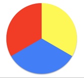
Figure #4: Step 1 for a Painter’s Color Wheel – Laying Out the Red, Yellow and Blue (RYB) primary colors
The next step in creating a Color Wheel involves positioning the secondary colors between the primary set of colors to create six divisions on the wheel. Secondary colors are obtained by mixing two primary colors. For Red, Yellow and Blue primary colors, the secondary colors are Orange, Green and Purple.
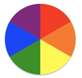
Figure #5: Step 2 for a Painter’s Color Wheel – Inserting the secondary colors of Orange, Green and Purple in between the Red, Yellow and Blue (RYB) primary colors.
The placing of tertiary colors adds twelve divisions to the Color Wheel. Tertiary colors are obtained by mixing and primary and secondary hues. Yellow-Orange, Red-Orange, Red-Purple, Purple-Blue, Blue-Green, and Green-Yellow are tertiary colors. More intermediate colors can be added to obtain twenty-four divisions or even forty-eight divisions.
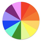
Figure #6: Step 3 for a Painter’s Color Wheel – Inserting the tertiary colors of Yellow-Orange, Red-Orange, Red-Purple, Purple-Blue, Blue-Green, and Green-Yellow.
Similar color wheels for Red, Green, Blue (RGB) and Cyan, Magenta and Yellow (CMY) color models can also be developed. In computer graphics and visualization, image generation is based on the display of a computer screen. As a result, we highlight the creation of the RGB Color Wheel in the next section of our paper.
The Color Wheel for the RGB Model:
Issac Newton is credited with having developed the first color circle or Color Wheel by joining the red and violet ends of the color visual spectrum into a circle. His initial concept was based on the Red, Green and Blue (RGB) additive primary colors of lights. Each of the colors is positioned equidistant from each other to create a triangle. Next, the corresponding complementary color is placed across from each RGB element. Complementary colors are pairs of colors that when mixed in equal proportions of light produce a neutral color (usually gray). For Red, the complementary color in RGB space is Cyan. For Green, the complementary color in RGB space is Magenta. For Blue, the complementary color in RGB space is Yellow. These colors fall in a circle or Color Wheel in the order of wavelengths of corresponding spectral colors with the exception of Magenta. Magenta is not a spectral color but was added by Newton to complete the color circle.
Alfred Munsell explored quantifying the circumference of the Color Wheel in terms of Hue and the radius of the Color Wheel in terms of Saturation. This resulted in the development of a formal color system and color atlas entitled the Munsell System. Our Color Theory background section discussion further highlighted Alfred Munsell’s contribution to color theory,
As we further explore the complements of RGB space, we discover the RGB complements to be Cyan, Magenta and Yellow (CYM). The CYM joined with key black becomes the subtractive model for color printing known as CYMK. So, there is a clear inverse relationship between the additive RGB color space and the CYM subtractive color space that we can apply when converting our visualization imagery from the computer screen into print. Adobe Photoshop and other Color Management systems have developed algorithms for effectively applying this relationship in practice.
Hue, Saturation and Brightness (HSL) & Hue, Saturation and Value (HSV) models:
With the beginning of computer graphics, there became a desire for digital control of color display monitors. In a color monitor, the red, green and blue (RGB) electronic guns excite respective phosphors to create digital imagery. The range of colors created with this process is called the RGB monitor gamut. Each display has its own RGB gamut profile or range. Color printers or other type of digital output device also has a color gamut.
The additive RGB additive color model along with the CMY and RYB subtractive colors models do not define color relationships in the same manner that the human eye does. The Hue Saturation and Brightness (HSL) as well as the Hue Saturation and Value (HSV) models attempt to improve upon the RGB color model in regard to human perception. Our discussion below will focus on describing the HSV color model.
Hue is used to define a particular color selection. It is more specifically described in terms of a wavelength dimension given to a specific color. The Color Wheel provides the reference frame for diagramming hues for the HSV color model. The change of a given color can be described with two key parameters: The lightness or darkness of a color is expressed in terms of Value. The overall intensity or strength of the spectral light is described by Value. For the HSV color model, Value is the linear axis running through the middle of the Color Wheel. Saturation refers to the dominance of hue in a color. At the outer edge of the Color Wheel, color hues are “pure” or dominant with the HSV color model. Moving toward the central linear axis, color hues decrease in Saturation. Along the central axis, desaturation results and a grayscale forms. The grayscale runs from white to black with all of the immediate grays in between. The HSV color model thus is a three dimensional cone representation. Our explorations of color theory, including the HSV color model for computer graphics, demonstrate the importance of the Color Wheel as a basic reference frame for diagramming color relationships.
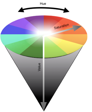
Figure #7: Three dimensional cone representation of the Hue, Saturation and Value (HSV) color model for color display devices.
Color Schemes:
With our Color Wheel as a guide, we can next develop color schemes that guide in combining various hues together in a graphic design or visualization. A color scheme that combines values of a single hue, mixing various color saturations from almost white to very dark is called a monochromatic color scheme.
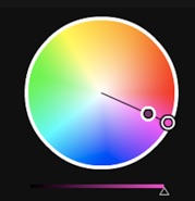

Figure #8: Example of a Monochromatic Color Scheme for the color Magenta. The color hues vary in saturation from the center core to the outside boundary of the color wheel.
We can increase in color scheme complexity by combining two colors together. Two hues that are opposite from each other on the Color Wheel form a complementary color scheme.
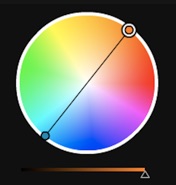
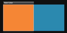
Figure #9: Example of a Complementary Color Scheme of Orange and Cyan. The colors oppose each other on the Color Wheel.
A split complementary color scheme combines a color with two colors that are adjacent on either side of its complementary color. This steps up to a color scheme with three hues.
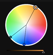

Figure #10: Example of a Split Complementary Color Scheme with Blue and Blue Green being the split complementary colors to Orange on the Color Wheel.
An analogous color scheme frequently includes three colors that are adjacent to each other on the color wheel. With the analogous color scheme, often one color is the dominant color with adjacent hues used to enhance the color scheme.
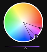
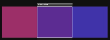
Figure #11: Example of an Analogous Color Scheme of Red Purple, Purple and Blue Purple – three colors adjacent to each other on the Color Wheel.
The triadic color scheme includes three colors that are equally space around the color wheel. Red, Yellow and Blue (RYB), the painterly primary colors, as well as Orange, Green and Purple, the painterly secondary colors, are examples of triadic color schemes. Red, Green and Blue (RGB), the additive primary colors of light, and Cyan, Yellow and Magenta (CYM), the subtractive colors associated with color printing, are other examples of triadic color schemes.
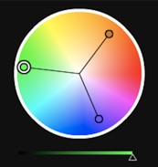

Figure #12: Example of a Triadic Color Scheme of Orange, Green and Purple– three colors equally spaced from each other on the Color Wheel.
A tetradic color scheme uses four colors. A popular tetradic scheme includes combining two complementary color pairs. Red and Green combined with Orange and Blur, complementary color pairs from the RYB painterly color space, produces a tetradic color scheme. These color schemes are optimized when one of the four colors dominates the composition.
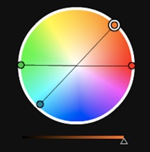

Figure #13: Example of a Tetradic Color Scheme on the Color Wheel. This example depicts two complimentary pairs of colors: Red and Green with Cyan and Orange.
Another tetradic color scheme is the Accented Analogous Color Scheme. Accented Analogous Color Schemes include three analogous colors and the middle analogous color’s complementary element. On a RYB Color Wheel, the Purple, Red and Orange analogous color elements combined with Red’s Complementary Color (Green) form an Accented Analogous Color Scheme.


Figure #14: Example of an Accented Analogous Color Scheme with the three analogous colors of Red Purple, Purple and Blue Purple combined with the Green Yellow (Lime Green) complementary color on the Color Wheel.
A neutral color scheme includes colors that are not on the Color Wheel such as beige, brown, gray, black and white. When a neutral color scheme expands to include colors on the Color Wheel, it is termed an Accented Neutral Color Scheme.
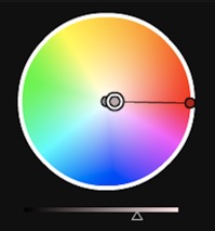

Figure #15: Example of an Accented Neutral Color Scheme with the three neutral colors of White, Gray and Gray Brown combined with a Red accent color on the Color Wheel.
Color Wheel and Color Scheme Software Tools:
Software like Adobe Photoshop allows for creating digital imagery with the color concepts we have previously discussed in this paper. There are also many online or mobile application tools that allow for color scheme analysis and creation.
Adobe has developed an online tool entitled Kuler that allows for establishing a color scheme from an existing color digital image. This tool is available at (http://kuler.adobe.com/). Color Scheme Designer, another online tool, assists with creating and evaluating color schemes. Color Scheme Designer is available at (http://colorschemedesigner.com/). Pantone has developed an application for the iPhone, iPod or iPad that helps with color selections entitled “myPANTONE”. myPANTONE is available from Apple’s itunes site at (http://itunes.apple.com/us/app/mypantone/id329515634?mt=8).
There are numerous other color palette tools for online and mobile applications that can be found by searching the Web. Two online listings include sitepoint.com’s listing at (http://blogs.sitepoint.com/21-stimulating-color-palette-tools-for-designers/) and instantshift.com’s listing at (http://www.instantshift.com/2011/02/04/effective-color-palette-and-color-scheme-generators/)
ColorBrewer is another excellent online system targeted at cartographic visualization efforts. In 2001 and 2002,Cynthia Brewer and Mark Harrower of Pennsylvania State University originally created their “color advice for maps tool” with funding from the United States of America’s National Science Foundation (NSF), (http://www.personal.psu.edu/cab38/ColorBrewer/ColorBrewer.html).
An upgraded version, ColorBrewer 2.0, was developed in 2009 with funding from Axis Maps. LLC., (http://colorbrewer2.org/).
Our future sections on creating and analyzing digital color schemes for visualization will focus on the use of Adobe’s Kuler tool as well as the use of Color Scheme Designer. Other color palette tools can also be used for this purpose.
Analyzing Digital Images with the Color Wheel and Color Schemes:
One way to explore color hue relationships is to work with a basic object or image of an object. Josef Albers studied color relationships in his Homage to a Square set of paintings created over a twenty-five year period. In these abstract paintings, Albers depicted many variations of the color schemes we described in the previous section of this paper.
In my own color analysis work, I am partial to taking digital imagery of roses and analyzing the associated hue, saturation and value parameters. For the color analysis work, I use Adobe’s Kuler tool to import a JPEG version of my digital image for initial hue analysis. Next, I use the online tool, “Color Scheme Designer”, to diagram the color relationships or schemes on a Color Wheel. Below, we show a digital image of a rose with magenta, orange and white hues.

Figure #16: Digital Image of a Rose with Magenta, Orange and White Hues. We will use this image for further color analyses.
For our color analysis, we will focus on the magenta and orange colors. We can use Adobe’s Kuler tool (http://kuler.adobe.com/) to precisely examine the color elements in the digital image of our rose. With the Kuler tool, we are able to examine five points on a digital image to establish an actual color scheme. If we have more than five basic color elements, we can repeat the use of the Kuler tool until we capture the fundamental color scheme. For our rose image, five color elements will suffice. We present the actual color elements evaluation below.
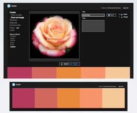
Figure #17: Color Analysis of the Magenta and Orange Hue elements in the digital image of our rose. Our Color Analysis was performed with Adobe’s Kuler tool: (http://kuler.adobe.com).
We can now use the Color Scheme Designer tool (http://colorschemedesigner.com/) to analyze our rose’s color scheme. As we examine the color wheel, we notice the magenta and orange are in close proximity to each other. Color Scheme designer allows us to select an analogous color relationship to discover that magenta, red and orange are adjacent hues on the Color Wheel. So, we have an almost analogous color scheme that includes Magenta and Orange with the neutral hue of White serving as a bridge color.
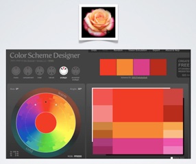
Figure #18: Color Scheme Evaluation of the Magenta and Orange Hue elements in the digital image of our rose. An analogous color scheme is shown using the Color Scheme Designer online tool available at (http://colorschemedesigner.com).
Applying Color Scheme Concepts to Creating Visualizations:
We can apply color scheme concepts in developing visualizations. Below, we show a three dimensional object that is a derived from a computational physics model of a Supernova or dying star. To emphasize data value changes, we use an analogous color scheme of Yellow, Green and Blue. Color Scheme Designer helps us locate the digital values of these hues.

Figure #19: Visualization of a three dimensional object derived from a computational physics model of a Supernova or dying star. The visualization was done with CEI’s Insight software tool, see: (http://www.ensight.com/).
For our visualization, we chose Yellow as our dominant color for the analogous scheme with Green and Blue emphasizing additional numeric changes. The highest data values of the Supernova visualization actually appear around the edge of our three dimensional object. We emphasize these changes by applying a complementary color scheme. With Color Scheme Designer, we determine the complementary color to yellow to be blue-purple. We show both the analogous and complementary color schemes using Color Scheme Designer below.
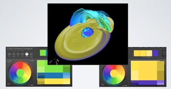
Figure #20: Two color schemes were applied in designing this Supernova visualization. An analogous color scheme of Yellow, Green and Blue was applied to depict the data values across the three dimensional object. A complementary color scheme of Yellow and Purple was selected to emphasize the data values at edge of the Supernova visualization. We depict these color schemes using the Color Scheme Designer online tool available at (http://colorschemedesigner.com).
Using the color values from Color Scheme Designer, we transferred these color selections into CEI’s Ensight software tool to build initial color maps. Below, we show a detailed analysis of the color elements of our actual Supernova visualization, using Adobe’s Kuler tool below.
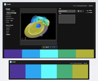
Figure #21: Using Adobe’s Kuler tool: (http://kuler.adobe.com), the color hues across our Supernova Visualization are examined in detail. We can modify our color options further if we so desire.
For a second example, we show a Hurricane Katrina visualization based on the execution of a Weather Research Forecasting (WRF) computational model.

Figure #22: Visualization Hurricane Katrina data from the Weather Research Forecasting (WRF) computational model. . The visualization was done with the VisIt software tool, see: (https://wci.llnl.gov/codes/visit/).
We also use Color Scheme Designer to show our color scheme selections. To depict the hurricane, we used an analogous color scheme of “Magenta”, “Purple” and “Blue”. Our dominant colors in this analogous color scheme are the Blue hues. This allows use to use Magenta and Purple hues to emphasize the formation of the modeled hurricane in our time series animation. To depict the wind vectors, we used a complementary color scheme based on the dominant Blue hues. Orange tones form this complementary color range. Using the color values from Color Scheme Designer, we transferred these color selections into the VisIt software tool to build initial color maps. An iterative process of color tweaking resulted until we obtained our desired final color maps for the visualization.
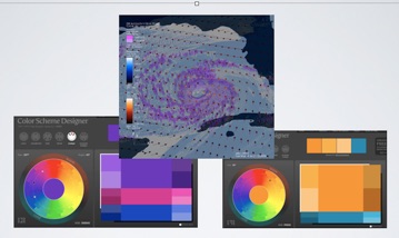
Figure #23: Two color schemes were applied in designing the Hurricane Katrina visualization. An analogous color scheme of Magenta, Purple and Blue was applied to depict the data values across the hurricane data. A complementary color scheme of Orange and Blue was selected to emphasize the wind vector data values. We depict these color schemes using the Color Scheme Designer online tool available at (http://colorschemedesigner.com).
Conclusion:
In this paper, we have discussed a few artistic concepts of color theory and shown how to apply these notions to designing visualizations. Additionally, we have provided some historical background on color theory. Color models, color wheel and color scheme concepts have been introduced. We then used these concepts to examine digital images as well as building color maps for specific data visualization examples. In our discussions, we used Adobe’s Kuler tool (http://kuler.adobe.com) and Color Scheme Designer (http://colorschemedesigner.com/).
References:
Newton, Sir Isaac, Opticks: or, a Treatise of the Reflexions, Refractions, Inflexions and Colours of Light. Also Two Treatises of the Species and Magnituder of Curvilinear Figures, London: Samuel Smith and Benjamin Walford, 1704.
Available from The Project Gutenberg EBook of Opticks:
http://www.gutenberg.org/files/33504/33504-h/33504-h.htm
Goethe, J.W. von, Theory of Colours, Tübingen, (translated from German by Charles Locke Eastlake), John Murray, London, 1840.
Available as a Google Book: http://books.google.com/books?id=OIoIAAAAMAAJ&printsec=frontcover&source=gbs_ge_summary_r&cad=0#v=onepage&q&f=false
Chevreul, M..E., The Laws of Contrast of Colour: And Their Application to the Arts, (translated from French by John Spanton), G. Routledge & Co., New York, N.Y., 1857.
Helmhotz, H. von, Handbuch der physiologischen Optik, (2 vols., 1856, 1867), translated into English by J. P. C. Southall as “Handbook of Physiological Optics.” New York: Dover Publications; 1924–25.
Lang, H., “Color Vision Theories in Nineteenth Century Germany between Idealism and Empiricism”, Color Research & Application, Vol. 12, Issue 5, October 1987, Wiley Periodicals, Inc., Hoboken, New Jersey, (pp 270 – 281).
Online Abstract available at:
http://onlinelibrary.wiley.com/doi/10.1002/col.5080120509/abstract
Gatter, M., Getting it Right in Print: Digital pre-press for Graphic Designers, Laurence King Publishing, London, 2004
Available as a Google Book:
Munsell, A. H., A color notation, G. H. Eillis Co., Boston, 1905
Available as a Google Book:
http://books.google.com/books?id=PgcCAAAAYAAJ&printsec=frontcover#v=onepage&q&f=false
Munsell, A. H., Atlas of the Munsell Color System, Wadsworth, Howland & Co., Malden, Mass, 1915.
Nickerson, D., “History of the Munsell Color System and its Scientific Application”, Journal of the Optical Society of America (JOSA), Vol. 30, Issue 12, December 1940, pp. 575 – 586.
Online Abstract available at:
http://www.opticsinfobase.org/josa/abstract.cfm?URI=josa-30-12-575
Broadbent, A. D. “A critical review of the development of the CIE 1931 RGB color-matching functions”, Color Research & Applications, Vol. 29, Issue 4, August 2004, pp. 267-272.
Shevell, S.K. (editor), The Science of Color (2nd Edition), Optical Society of America, Elsevier, Oxford, UK, 2003.
Available as a Google Book:
Lupton, E. & Miller, J.A., The ABC’s of Bauhaus , The Bauhaus and Design Theory, Princeton Architectural Press, Princeton N.J., January 1996.
Bergdoll, B. and Diekerman, L., Buahaus 1919 – 1933 Workshops in Modernity (Exhibition Catalog), Museum of Modern Art, New York, New York, 2009
Available as a Google Book:
Bergdoll, B. and Diekerman, L., Buahaus 1919 – 1933 Workshops in Modernity (Exhibition Web Site), Museum of Modern Art, New York, New York, 2009:
http://www.moma.org/interactives/exhibitions/2009/bauhaus/\
Kandinsky, W., Über das Geistige in der Kunst, 1911, translated into English by M.T.H. Sadler as “The Art of Spiritual Harmony and published in 1914, MFA Publications, New York, New York.
Available from The Project Gutenberg EBook of Concerning the Spiritual in Art.
http://www.gutenberg.org/cache/epub/5321/pg5321.html
Klee, P., Das bildnerische Denken, 1956, translated into English by R. Manhiem as The Thinking Eye – The Notebooks of Paul Klee, Lund Humphries, London, 1961.
Klee, P. and Felix Klee, The Diaries of Paul Klee, 1898 – 1919, University of California Press, Berkeley, Ca., June 1968.
Available as a Google Book:
Itten, J., Kunst der Farbe, 1961, translated into English and published in the United States of America as The Art of Color: The Subjective Experience and Objective Rationale of Color, John Wiley & Sons, New York, New York, 1974.
Available as a Google Book:
Albers, J., Interaction of Color, Yale University Press, New Haven & London, 1963. (A complete edition with full color plates was published by Yale University Press in 2009: http://yalepress.yale.edu/book.asp?isbn=9780300146936).
Earlier Version is available as a Google Book:
Smith, A. R., “Color Gamut Transform Pairs”, Computer Graphics (SIGGRAPH ‘78 Conference Proceedings), 12:3, August 1978, pp 12 – 19.
Available online at: (http://alvyray.com/Papers/color78.pdf)
Stone, M.C., A Field Guide to Digital Color, A.K. Peters Ltd., Natick Ma., 2003
Available as a Google Book:
Ford, J.L., “Color Theory: Overview”, in the Worqx.com web site (1998 – 2009).
Available online at: (http://www.worqx.com/color/index.htm).
Brewer, C. A., Hatchard, G.A., and Harrower, M.A., 2003, ColorBrewer in Print: A Catalog of Color Schemes for Maps, Cartography and Geographic Information Science 30(1): 2003, pp. 5-32.
Gregory, A., “21 Stimulating Color Palette Tools for Designers”, at sitepoint.com,
(http://blogs.sitepoint.com/21-stimulating-color-palette-tools-for-designers/), Febraury 2009.
Kumar, S., “Effective Color Palette and Color Scheme Generators”, at instanshift.com, (http://www.instantshift.com/2011/02/04/effective-color-palette-and-color-scheme-generators/). 2011.
Color Tools and Visualization Software:
Adobe’s Kuler Tool: http://kuler.adobe.com
Color Scheme Designer: http://colorschemedesigner.com/
ColorBrewer 2.0: http://colorbrewer2.org/
Color Stream: http://colorstreamapp.com/
CEI’s Ensight Visualization Tool: http://www.ensight.com/
VisIt Tool: https://wci.llnl.gov/codes/visit/
About the Author:
Theresa-Marie Rhyne is a recognized expert in the field of computer-generated visualization and a consultant who specializes in applying artistic color theories to visualization and digital media. She is currently consulting for the Scientific Computing and Imaging Institute (SCII) at the University of Utah.
In the 1990s, as a government contractor with Lockheed Martin Technical Services, she was the founding visualization leader of the US Environmental Protection Agency's Scientific Visualization Center. In the 2000s, she founded the Center for Visualization and Analytics and the Renaissance Computing Institute's Engagement Facility (renci@ncsu) at North Carolina State University. Rhyne is the editor of the Visualization Viewpoints Department for IEEE Computer Graphics & Applications magazine and serves on the Advisory Board of IEEE Computer magazine.
She received a BS degree, two MS degrees, and the Degree of Engineer in Civil Engineering from Stanford University. She entered the computer graphics field as a result of her computational and geographic modeling research in geotechnical and earthquake engineering. She is also an internationally recognized digital media artist who began creating digital media with early Apple computers, including the colorization of early Macintosh educational software. She is a senior member of the IEEE Computer Society and of the Association for Computing Machinery (ACM).